Design

  • Font Styles

    Font Styles

    Gostoso Coffee carefully selects typefaces that reflect our brand’s distinct personality: a balance of sophisticated tradition and vibrant Brazilian energy.

    Headlines use Bookmania

    Bookmania (https://www.marksimonson.com/fonts/view/bookmania)

    The quick brown fox jumps over the lazy dog

    Bookmania 700

    Font Size 38px

    Line Height 100%

    Why Bookmania? This bold, slightly condensed typeface commands attention, just as our premium coffee makes a statement. It exudes a sense of history and sophistication, with a hint of vintage charm that hints at our connection to Brazil’s rich coffee heritage. Bookmania ensures our headlines are impactful and easily recognizable. Plus, it’s an Adobe font, making it accessible for design teams and printing facilities with an Adobe license.

    Body Text use Poppins

    Poppins (https://fonts.google.com/specimen/Poppins)

    Why Poppins? This clean, geometric sans-serif font provides excellent readability across a wide range of sizes. Its neutral and approachable feel balances the bolder Bookmania and allows for a focus on the quality and story of our beans without distraction. Poppins’ clarity at small sizes makes it ideal for mobile displays, and its free availability adds versatility.

    Usage Guidelines

    • Headlines: Use Bookmania for main titles, key messages, and where a strong, attention-grabbing statement is needed.
    • Body Text: Utilize Poppins for all paragraphs, descriptions, and supporting text.
    • Hierarchy: Pair Bookmania headlines with Poppins body text to create a clear visual hierarchy that guides the reader through content.
    • Legibility: Always ensure that any text, whether Bookmania or Poppins, is used at a size that maintains legibility across all devices and formats.

    Poppins

    Poppins 400

    Font Size 16px

    Line Height 100%

    The quick brown fox jumps over the lazy dog


  • Colour

    Gostoso Colour Palette

    Core Colours

    Charcoal Black (#1a1a1a)

    This grounding colour embodies the earth itself, conveying strength, natural origins, and timeless elegance. Black offers a sophisticated backdrop that allows other elements, particularly our signature gold, to truly shine. It represents the richness of the soil and a commitment to the enduring quality that defines Gostoso.

    Sunlight Gold (#CC9541)

    Symbolizing the warmth of the Brazilian sun, Sunlight Gold evokes the luxurious quality of our beans, representing excellence and a touch of celebratory energy. This gold signifies more than just a precious metal; it embodies the richness of Brazilian culture and the transformative journey of coffee from bean to cup.

    Accent Colours

    Crisp White (#FFFFFF)

    Providing freshness, cleanliness, and a hint of modernity, Crisp White brings balance to Gostoso’s overall design. It suggests purity and underscores our commitment to quality, letting the beans themselves take centre stage, while adding a touch of refinement.

    Ocean Teal (#54d3e8)

    Evoking the vibrant energy of Brazil and its coastal landscapes, Ocean Teal is used in small doses to add a touch of vibrancy. This colour hints at the unique spirit of Brazil, adding a dimension of warmth and celebration often associated with its coastal regions.

    Rainforest Green (#899581)

    Representing Brazil’s lush landscapes, Rainforest Green symbolises our commitment to sustainability and the natural world of coffee. This green connects directly to the heart of our bean sourcing, reminding viewers of the precious ecosystem Gostoso strives to protect and the natural processes that allow exceptional coffee to thrive.

    Coffee Cherry Red (#d62544)

    Symbolising the coffee cherry and its ripeness, Coffee Cherry Red is used sparingly to draw attention in select applications. Like a perfectly ripe cherry, this red adds a touch of natural warmth and passion, showcasing the culmination of the coffee’s journey and hinting at the delectable flavours within.

    The Power of Black and Gold

    The deliberate pairing of Charcoal Black and Sunlight Gold underscores Gostoso’s core values. Black offers a timeless, sophisticated foundation, allowing the warm gold to radiate luxury and excellence. This refined combination emphasizes quality and creates a sense of prestige, reflecting Gostoso’s position as a premium coffee brand.

    Gold Gradients for a Dynamic Touch

    Adding subtle gradients to the Sunlight Gold infuses it with a sense of depth, luminosity, and life. Gradients suggest the way sunlight plays on precious metals, adding a touch of richness and mirroring the dynamic nature of Brazilian culture. This technique should be used thoughtfully to enhance the gold’s impact without compromising the clean and elegant aesthetic of Gostoso’s visual identity.


  • Logo

    Our Logo Speaks to our Heritage

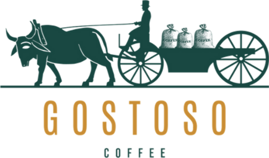
    The Gostoso Coffee logo is more than a visual mark; it’s a symbol of our unwavering dedication to the heart of coffee – Brazil. It tells the story of generations of farmers who have nurtured the land with respect, meticulously cultivating beans that embody the unique flavors of their origin. Our logo celebrates this rich heritage, the arduous journey from bean to cup, and our commitment to sustainable practices that honor both the land and the people who tend to it.

    Core Elements:

    • Minimalist Style Shape: Clean lines and a minimalist aesthetic provide a timeless framework for our logo, reflecting the enduring quality and simple beauty we find at the source of our coffee.
    • “GOSTOSO COFFEE” Text: Our brand name is presented prominently, often rendered in a retro-inspired font that evokes our deep connection to Brazil’s 300-year coffee legacy.
    • Ox-Drawn Cart Illustration: This image isn’t just a nod to tradition; it’s a powerful declaration. The farmer sits proudly on the cart, leading the way, just as we prioritize the well-being of our farming partners. The ox symbolizes strength born from the earth, while the beans themselves represent our commitment to quality, hand-selected with care.

    Conveying Our Values

    • Heritage and Tradition: We lead with our history, drawing inspiration from those who came before, championing traditional practices that respect the land.
    • Advocacy and Sustainability: The logo reflects our commitment to sustainable coffee production, working to return land to coffee cultivation, and supporting farming practices that protect Brazil’s precious resources.
    • Focus on Quality: The meticulous care of the farmer depicted on the cart highlights our dedication to hand-selected beans, ensuring the highest quality in every cup.
    • Unique Brazilian Identity: Gostoso embraces the vibrant spirit of Brazil while maintaining a sophisticated edge, ensuring we stand apart as a premium brand with a deep connection to its origins.

    Download the logo

    Full colour logo
    Black logo
    Gold logo
    White logo